Visor Guys
A full-service moving company located in Windsor-Essex county providing quality moving, assembly, and packing services.
Summary
Visor Guys sought out our expertise to elevate their brand through comprehensive branding, social media, and print design solutions. Our initial collaboration involved designing their first company trailer, a crucial asset in their moving business. We capitalized on this opportunity to streamline their brand identity, eliminate superfluous design elements, and reinforce their branding with innovative design assets.
Following the trailer’s successful launch, Visor Guys entrusted JMarketing to handle their social media content, Google Ads, and corporate branding initiatives. Moreover, the company invested in promotional materials to augment its advertising efforts, establishing a strong presence in the industry.
Social Media
Trailer Design
Print Marketing
The JMarketing team firmly believes that social media is a powerful communication tool that can help businesses connect with their target audience. With this in mind, we recognized that Visor Guys could greatly benefit from a strong social media presence and crafted a comprehensive strategy to achieve this goal. To enhance their online visibility, we designed visually stunning infographics that effectively communicate Visor Guys' serv. Our team carefully curated each design element to ensure the content was aesthetically pleasing and easily digestible for their customers. By leveraging social media and producing high-quality content, we are confident that Visor Guys will experience increased engagement and drive more business.
Designing an eye-catching trailer that effectively communicates a brand's message is no easy feat. Our team rose to the challenge and created a design that depicts movement and captures attention with its use of various lines and gradients.
We recognized potential customers would see the trailer for only a few seconds as it moved down the road, so we needed to make a strong impression quickly. To achieve this, we utilized big and bold letters in a striking font and bright hues that contrasted with the trailer's base color.
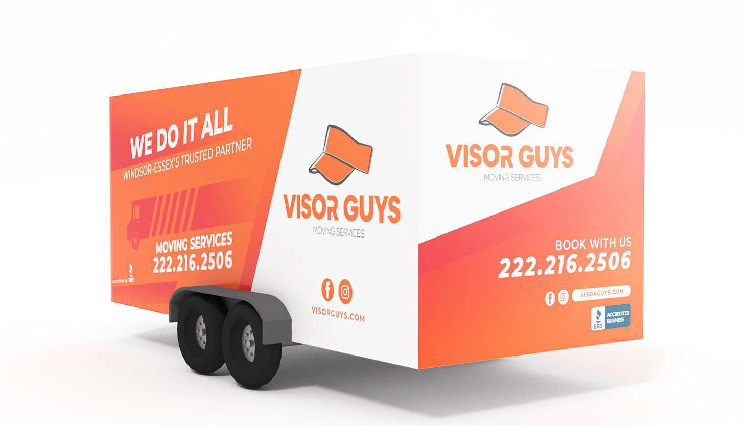
Throughout the design process, we kept in mind the importance of retaining the color orange, which has come to represent an affordable and friendly service. We used this color throughout the trailer to reinforce our client's brand messaging and create a cohesive look and feel.
By combining innovative design elements with strategic use of color and typography, our team was able to create a trailer that not only caught the eye but also effectively communicated our client's message to potential customers. The end result is a design that is both functional and visually appealing, helping our client to stand out in a crowded marketplace.
Our team continued to build on the unique tone established for Visor Guys by creating print materials that enhanced the brand's recognition within its target market. By employing innovative design techniques and cohesive branding elements, we crafted print materials that resonated with the brand's audience, helping to reinforce its position as an industry leader. The resulting print materials were visually appealing and highly effective in communicating the brand's message and enhancing its overall image.
PROMOTIONAL MATERIALS:
Flyers
Dynamic QR-Generated Cards
Lawn Signages
Letterheads
The JMarketing team firmly believes that social media is a powerful communication tool that can help businesses connect with their target audience. With this in mind, we recognized that Visor Guys could greatly benefit from a strong social media presence and crafted a comprehensive strategy to achieve this goal. To enhance their online visibility, we designed visually stunning infographics that effectively communicate Visor Guys' serv. Our team carefully curated each design element to ensure the content was aesthetically pleasing and easily digestible for their customers. By leveraging social media and producing high-quality content, we are confident that Visor Guys will experience increased engagement and drive more business.
Designing an eye-catching trailer that effectively communicates a brand's message is no easy feat. Our team rose to the challenge and created a design that depicts movement and captures attention with its use of various lines and gradients.
We recognized potential customers would see the trailer for only a few seconds as it moved down the road, so we needed to make a strong impression quickly. To achieve this, we utilized big and bold letters in a striking font and bright hues that contrasted with the trailer's base color.

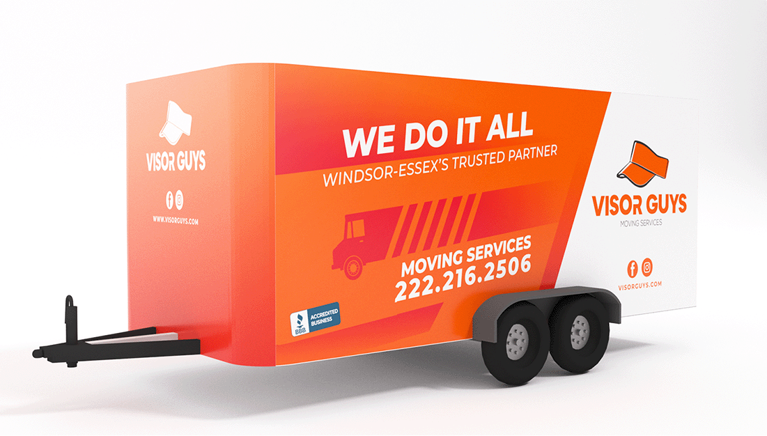
Throughout the design process, we kept in mind the importance of retaining the color orange, which has come to represent an affordable and friendly service. We used this color throughout the trailer to reinforce our client's brand messaging and create a cohesive look and feel.
By combining innovative design elements with strategic use of color and typography, our team was able to create a trailer that not only caught the eye but also effectively communicated our client's message to potential customers. The end result is a design that is both functional and visually appealing, helping our client to stand out in a crowded marketplace.
Our team continued to build on the unique tone established for Visor Guys by creating print materials that enhanced the brand's recognition within its target market. By employing innovative design techniques and cohesive branding elements, we crafted print materials that resonated with the brand's audience, helping to reinforce its position as an industry leader. The resulting print materials were visually appealing and highly effective in communicating the brand's message and enhancing its overall image.
PROMOTIONAL MATERIALS:
Flyers
Dynamic QR-Generated Cards
Lawn Signages
Letterheads
Here's what Visor Guys has to say...
"JMarketing is by far the greatest graphics/printing company I've dealt with. Their quality of work, professionalism and communication really sets them apart from their peers in the industry."